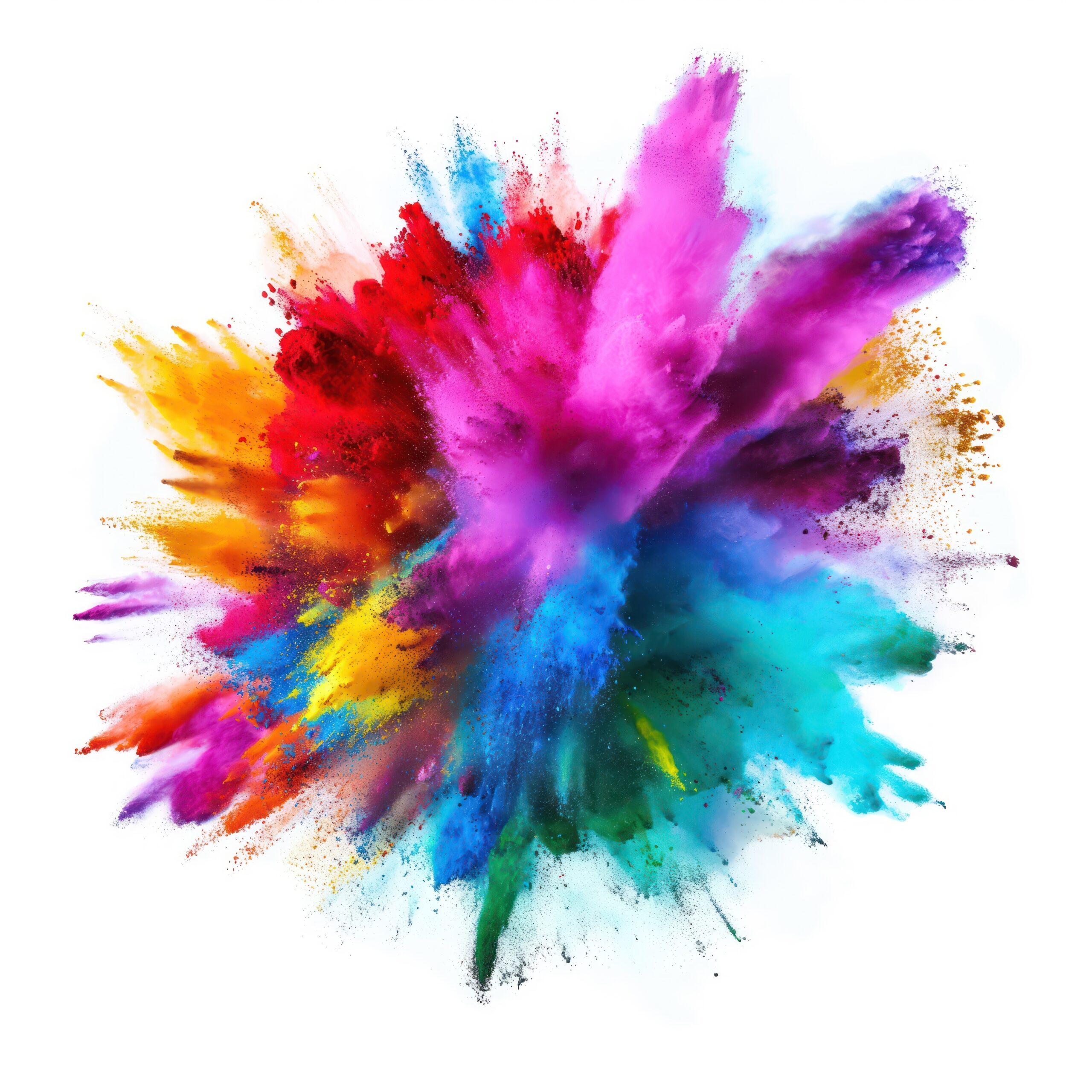
Colour is one of the most powerful tools in marketing. The colours you choose for your brand can shape how people feel, think, and act when they interact with your business. Understanding how colour affects perception and behaviour helps you connect with your audience on a deeper emotional level.
Why Colour Matters in Branding and Marketing
Research shows that people make a subconscious judgment about a product within just 90 seconds of seeing it. Up to 90% of that judgment is based on colour alone. That means your brand colours do more than look nice, they influence trust, emotion, and even buying decisions.
Whether you’re choosing colours for a new logo, a website redesign, or a marketing campaign, understanding colour psychology can help you make more strategic choices that truly resonate with your audience.
The Emotions Behind Common Brand Colours
Here are some of the most common colours used in branding and the emotions they tend to evoke:
- Blue – Trust, stability, professionalism
Used by brands like the NHS, Facebook, LinkedIn, and PayPal. Blue is calm, reassuring, and dependable. It’s often chosen by organisations that want to convey reliability and confidence. - Red – Passion, urgency, excitement
Used by Coca-Cola, YouTube, and Target. Red grabs attention and creates a sense of energy and urgency. It’s a great choice for brands that want to be bold, lively, and memorable. - Green – Health, growth, nature, money
Seen in brands such as ASDA, Spotify, and Starbucks. Green often represents freshness, balance, and sustainability, making it a popular choice for environmentally conscious or health-focused businesses. - Yellow – Optimism, happiness, warmth
Used by McDonald’s, Snapchat, and IKEA. Yellow captures attention quickly and communicates friendliness and positivity. It’s perfect for brands that want to feel cheerful and approachable. - Purple – Luxury, creativity, mystery
Found in brands like Cadbury, Hallmark, and Yahoo!. Purple blends sophistication with imagination, often associated with premium or artistic products. - Black – Sophistication, power, elegance
Used by Nike, Chanel, and Apple (often paired with white). Black adds a sense of authority and timelessness, ideal for brands that want to appear sleek and confident. - Orange – Energy, fun, friendliness
Seen in Fanta, Nickelodeon, and Amazon. Orange is youthful, energetic, and engaging. It creates excitement without being as intense as red.
How to Use Colour Effectively in Your Brand
Understanding colour psychology is just the first step. To make the most of it, you need to apply these insights strategically across your brand materials.
1. Know Your Audience
Different audiences respond to colours in different ways. For example, a financial services brand might use blue to build trust, while a children’s toy brand might lean towards bright yellow or orange for fun and energy. Think carefully about what your customers want to feel when they interact with your brand.
2. Stay Consistent
Consistency is key. Once you have chosen your colour palette, use it across every touchpoint from your website and social media, to packaging and signage. Consistent colour use builds recognition and strengthens trust over time.
3. Test and Iterate
The right colours can increase engagement and conversions, but it takes testing to get there. A/B test different colour combinations on calls-to-action, landing pages, and email buttons to see what resonates best with your audience. Data-driven design decisions always win.
4. Think About Contrast
Contrast helps important elements stand out. Make sure your call-to-action buttons, offers, and headlines have enough visual contrast to draw the eye. Not only does this improve design clarity, but it can also boost click-through rates and conversions.
Colour as a Strategic Advantage
Colour psychology is not about following trends. It’s about using colour purposefully to tell your brand story, influence perception, and create emotional connections. When used well, colour can become one of your most valuable branding assets – helping your business to stand out, build loyalty, and drive results.
At Pixel Advertising, we help businesses use design and strategy to make meaningful connections. From brand identity development to campaign execution, our team ensures every colour choice supports your goals and speaks to your audience in the right way.
We can help you build a stronger brand through strategy, creativity, and consistency, why not talk to us today!