A logo is one of the hardest-working assets your brand will ever own. It sits on your website, your packaging, your signage and your social profiles, and it has to do its job in a split second, every single time someone sees it. Get it right, and it becomes instantly recognisable. Get it wrong, and it can hold a brand back for years.
Whether you’re briefing a designer or having a go yourself, these are the principles we always come back to at Pixel Advertising when we’re developing a logo.
1. Prioritise legibility
A logo only works if people can read it, so legibility should always come first.
- Choose clear, readable fonts, especially at smaller sizes.
- Avoid overly decorative or intricate typefaces unless they’re used very intentionally, for example for a luxury brand.
- Test how the logo looks across different formats, from a website favicon to a business card to large-scale signage.
2. Keep it simple
Some of the most memorable logos in the world are also the simplest. Simplicity isn’t a limitation, it’s what makes a logo recognisable at a glance.
- Aim for a design that’s instantly recognisable in a blink.
- Think minimalist. Strong logos often have just one or two elements, whether that’s text and a symbol or simply stylised text.
3. Make it versatile
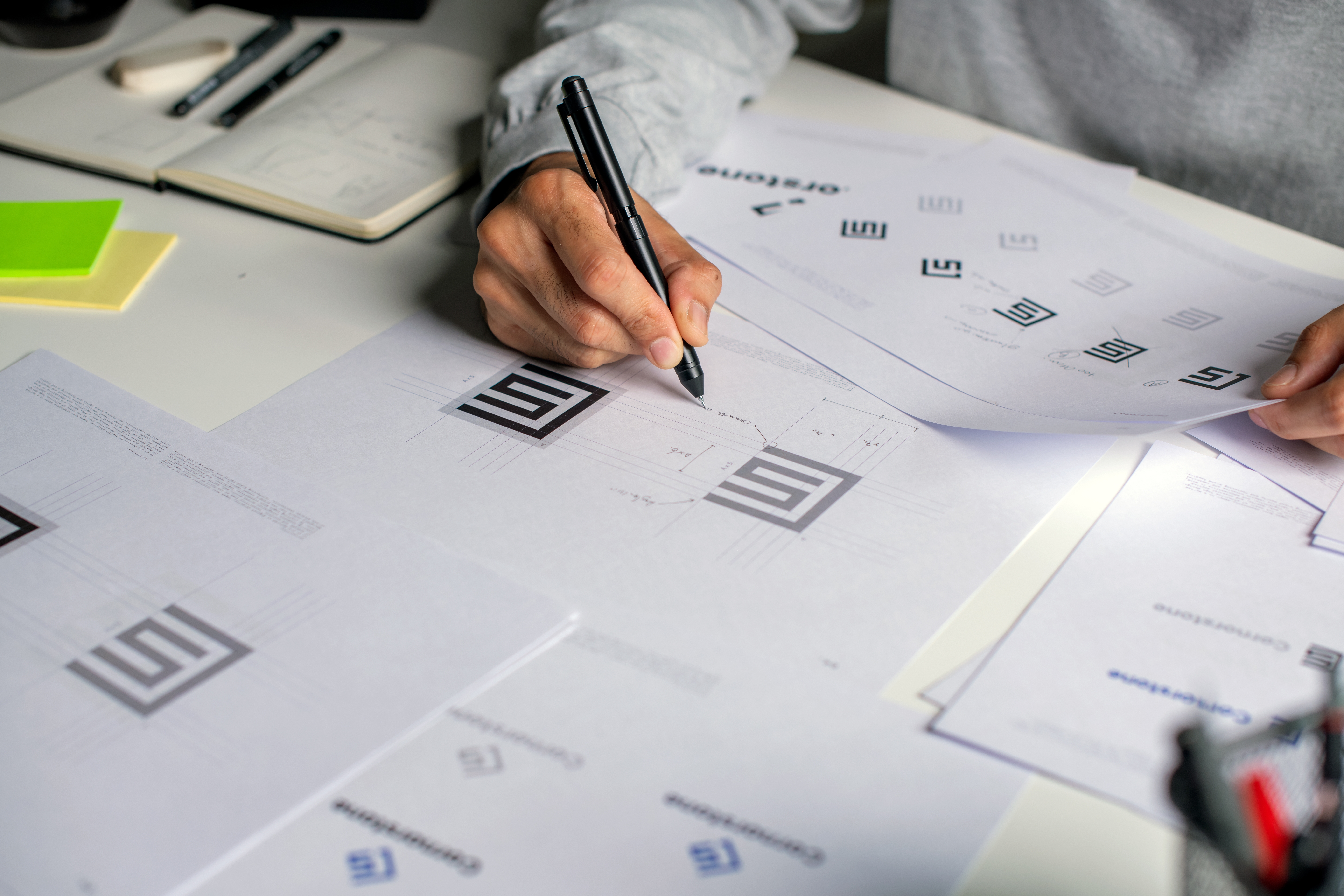
Your logo needs to work everywhere your brand shows up, not just in the one format it was designed in. Before you sign off a design, check it looks great in:
- Black and white
- Colour
- Small and large sizes
- Light or dark backgrounds
Vector format is essential here too. It’s what allows your logo to scale up or down without losing quality, whatever the application.
4. Reflect brand personality
Typography and style do a lot of heavy lifting when it comes to personality. The tone of your logo should match the tone of your brand:
- Bold and strong for tech or industrial brands.
- Playful and round for kids’ or casual brands.
- Elegant and serif for luxury or traditional brands.
5. Avoid Trends That Don’t Last
Trends can date a logo fast. What looks fresh on a design blog this year can feel tired within a couple of seasons. Focus on timeless design elements rather than what’s currently popular, and your logo will still be doing its job a decade from now.
6. Think About Cultural Nuances
If your audience reaches beyond the UK, a little extra care goes a long way.
Make sure the typeface doesn’t unintentionally resemble something else. A gothic-style font, for example, might suggest horror or religion rather than the tone you’re going for.
While English is widely understood, avoid slang or idioms that might confuse non-native speakers if your audience is global.
Final Tip: Do Your Research Before You Start
If you’ve got a fantastic logo idea forming in your mind, check it isn’t already out there before you go all in on collateral and a new website.
Quite often our subconscious minds store designs we’ve seen in the past, then sneakily present them back to us as our own during a lightbulb moment. Pretty much everything we see or are exposed to has been built from something already in existence, so it’s worth being mindful of that. You can still have fun with it, just do your homework first.
FAQs: Logo Design
How much does it cost to have a logo designed?
Costs vary depending on the scope of work, from a standalone logo to a full brand identity system. At Pixel Advertising, we scope every project around what the brand needs, rather than a one size fits all price.
How long does the logo design process take?
Most projects take a few days from initial concepts through to final files, though this depends on the complexity of the brief and how many rounds of feedback are needed.
What files should I receive once my logo is finished?
You should always come away with vector files (such as EPS or AI), alongside PNG and JPEG versions in various colourways, so your logo is ready for print, digital and everything in between.
Can I update my logo without starting from scratch?
Often, yes. A refresh can modernise a logo while keeping the recognition you’ve already built, which is usually more effective than a full rebrand.
Do I need brand guidelines as well as a logo?
We’d always recommend it. A logo is only one part of a bigger picture, and guidelines make sure it’s used consistently everywhere your brand shows up.