
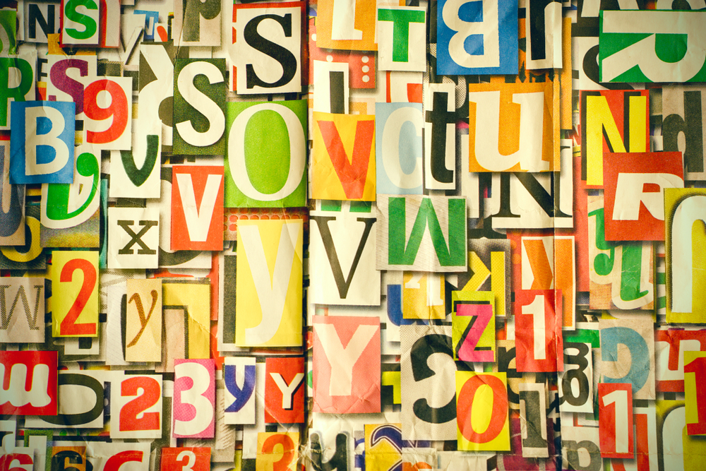
In short: typography matters in branding because it communicates personality, tone and credibility before anyone reads a word. Used consistently, it builds recognition and trust, and it also shapes usability by guiding readers through hierarchy, spacing and flow, making it a strategic tool, not just a design choice.
When we think of branding, our minds often jump to logos, colour palettes, and sleek visuals. But there’s one element that quietly influences how your audience feels about your brand, and it’s often underestimated: typography.
Typography isn’t just about picking pretty fonts. It’s about using the shape of letters and the rhythm of spacing to communicate your brand’s personality, values, and credibility – often before a single word is read.
Let’s explore why typography deserves a front-row seat in your branding strategy.
Typography speaks before you do
Your typeface is often the first voice your brand uses, even in silence.
A luxury brand might choose a high-contrast serif that feels timeless and refined. A tech startup may opt for a sleek, geometric sans-serif that screams innovation. A children’s brand? Likely something playful, rounded, and inviting.
Typography has tone. It can be bold or soft, corporate or creative, modern or nostalgic. Choosing the right one ensures your brand “speaks” the right language from the first glance.
Consistency Creates Recognition

Just like your colours and logo, typography helps build visual consistency. When used thoughtfully and consistently across your website, packaging, marketing materials, and social media, your typography becomes recognisable – a visual signature that builds trust and familiarity over time.
Think of Coca-Cola’s script, or Apple’s crisp, minimalist type. The fonts are part of the brand story.
Typography guides the user experience
Good typography doesn’t just look nice, it improves readability, hierarchy, and navigation. It helps your audience know where to look, what’s important, and how to absorb your message with ease.
Font size, line spacing, and weight all work together to make your content not just beautiful, but functional. Great brands know this balance is key.
It differentiates you in a crowded market
In a sea of sameness, custom or well-curated typography can make your brand stand out. Even subtle choices, like a unique headline font or a signature typographic treatment, can set you apart and make your communications unmistakably yours.
Typography is one of the few tools that can be both consistent and flexible, allowing you to evolve your visuals without losing identity.
It shows you have an eye for detail
Customers may not always consciously notice your typography, but they feel it. Sloppy type can signal amateurism. Thoughtful, elegant type signals professionalism, intentionality, and brand maturity.
In short, your type choices tell people how much you care.
Final Thoughts
Typography is more than decoration, it’s communication. It shapes how your audience sees, feels, and remembers your brand. When used intentionally, it becomes a powerful, strategic tool that enhances every aspect of your brand experience.
So, the next time you think about your brand identity, don’t overlook the letters that hold it all together.
At Pixel Advertising, we can help you choose a typeface that tells your story – clearly, confidently, and beautifully. Contact us today and we can support you on that journey.
Frequently Asked Questions
Why does typography matter for branding?
Typography communicates personality, tone and credibility before anyone reads a single word. A luxury serif, a geometric tech sans-serif, or a playful rounded font all set an emotional expectation instantly, shaping how people perceive your brand from the first glance.
How does typography affect brand recognition?
Used consistently across your website, packaging, marketing materials and social media, typography becomes a visual signature, in the same way colour and logo do, helping people recognise your brand and building trust and familiarity over time.
Can typography really impact user experience?
Yes. Font size, line spacing, weight and hierarchy guide readers through content, helping them know where to look and what matters most. Good typography makes content easier to absorb, not just more attractive.
What makes a typeface feel premium versus playful?
A high-contrast serif tends to feel timeless and refined, suiting luxury brands, while rounded, softer letterforms feel playful and approachable, often used for children’s or lifestyle brands. A geometric sans-serif tends to signal modernity and innovation.
Should I use a custom font for my brand?
Not necessarily, a well-curated existing typeface used consistently can be just as effective as a custom one. What matters most is applying your chosen font thoughtfully and consistently so it becomes recognisably yours.
How often should a brand review its typography?
There’s no fixed schedule, but it’s worth revisiting typography alongside any broader brand refresh, or if your current fonts no longer reflect how your business has evolved. Consistency matters more than frequent change.